Week 3- GIMP drawing


Title: "Vegetables & plants"

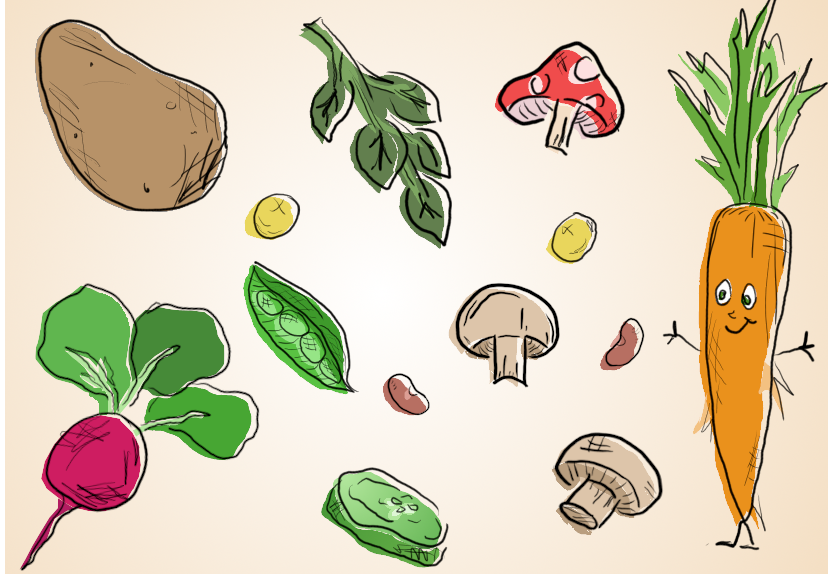
I had a lot of fun with this project and I'm very proud of the final product. I drew the outlines of each vegetable and organized them into different layers, then I selected them using mostly free select, but also with the path tool, and created a new layer called "colors" which has all the background colors of each plant. Then at the end, I transformed the colors layer a little bit down and to the left to add some depth and character to the drawing- that's why the outlines don't match the edge of the colors exactly. I like the effect because it makes everything pop out a little bit. Lastly, I used gradients on the background ot make it more interesting, and on the cucumber slice, as they are whiter in the center and I wanted to illustrate that.

🐑Week 10 Vector Drawing🌙


Title: "Sleepy Sheepy" 🌠

A pink sheep jumping over a blue moon

For this image, I used the gradient tool on the moon to make it lighter at the top. This adds depth and character, and matches the color difference between the sheep's face and the rest of his fur. To get the outline of the moon, I made a temporary layer with a black circle, and added a smaller white circle to overlap it, creating the crescent shape. Then in a new layer, I traced what was left of the black circle with the Bezier Curve tool, and modified the points until I got a smooth shape. To make the sheep, I used the pencil tool and then modified the points with the very useful "edit paths by nodes" tool. I think he turned out really cute!

Week 11- Info Poster


Title: "Traveling"

Week 12 Inkscape final project


Topic: Architecture & Interior Design


Image 1: Logo

After scrolling through google images for inspiration, I decided to create my own logo for an architecture and interior design company. I think this logo does a good job of showing that this hypothetical company does both, having the house with furniture inside shows the interior design portion and the three buildings all together shows architecture. In this image, I used the rectangle shape tool to create that black silhouette of a building on the left side, and I used the circle tool to create the circular frame for the logo. For the chimney on the house, I drew a pentagon and then used the "difference" path tool to cut out an unneccesary corner of the chimney where it overlaps with the house.


Image 2: Drawing

I decided to snap a picture of the living room in my apartment and use that as a reacing/photo reference to make a sketch-like drawing. I used the circle shape tool for the clock, and the rectangle shape tool for the TV. Everything else was mostly created with the bezier curve/straight line tool, but the plant was hand-drawn and modified. Lastly, the exclusion tool was used on the feet of the plant pot, to exclude unnecessary parts.

Week 13 Typography


Blue Elephant Clothing Co.

Blue elephant Logo

I used InkScape to make this logo. I started with a reference photo of a baby elephant that I found on Google Images, and then from there I traced it, modified it and simplified it until it became this cute little minimalist outline. I'm trying to convey a soft, safe feeling with the typography and color scheme. I was thinking this would be a cute baby clothing brand, maybe specializing in boy's clothes, or it could be unisex. The font I used is a bit playful and has a slight hand-written feel to it, but it also maintains a clean professional look, and wrapping the text around the logo ties it all together neatly.

Final Project


Title: "Kitty Gallery" 🐱